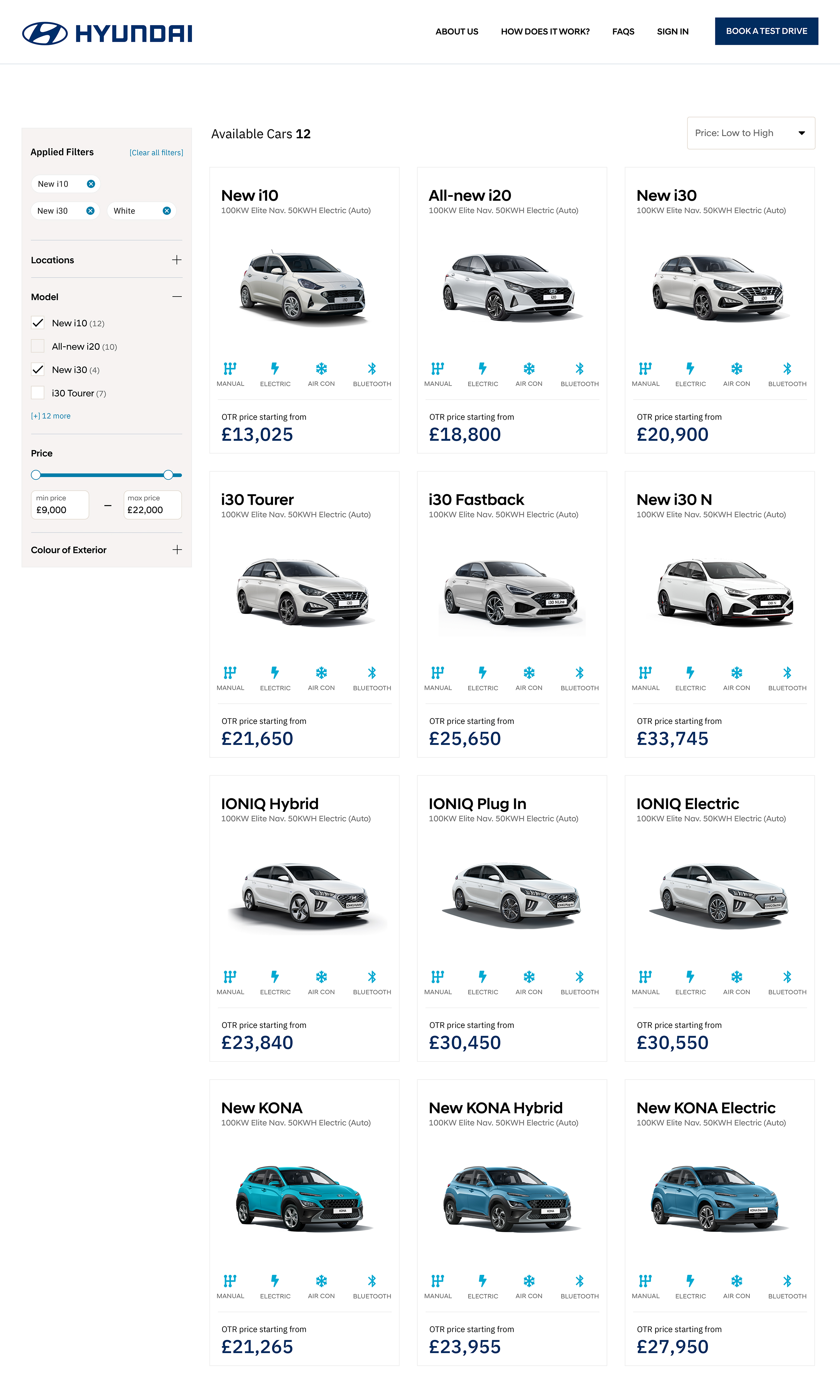
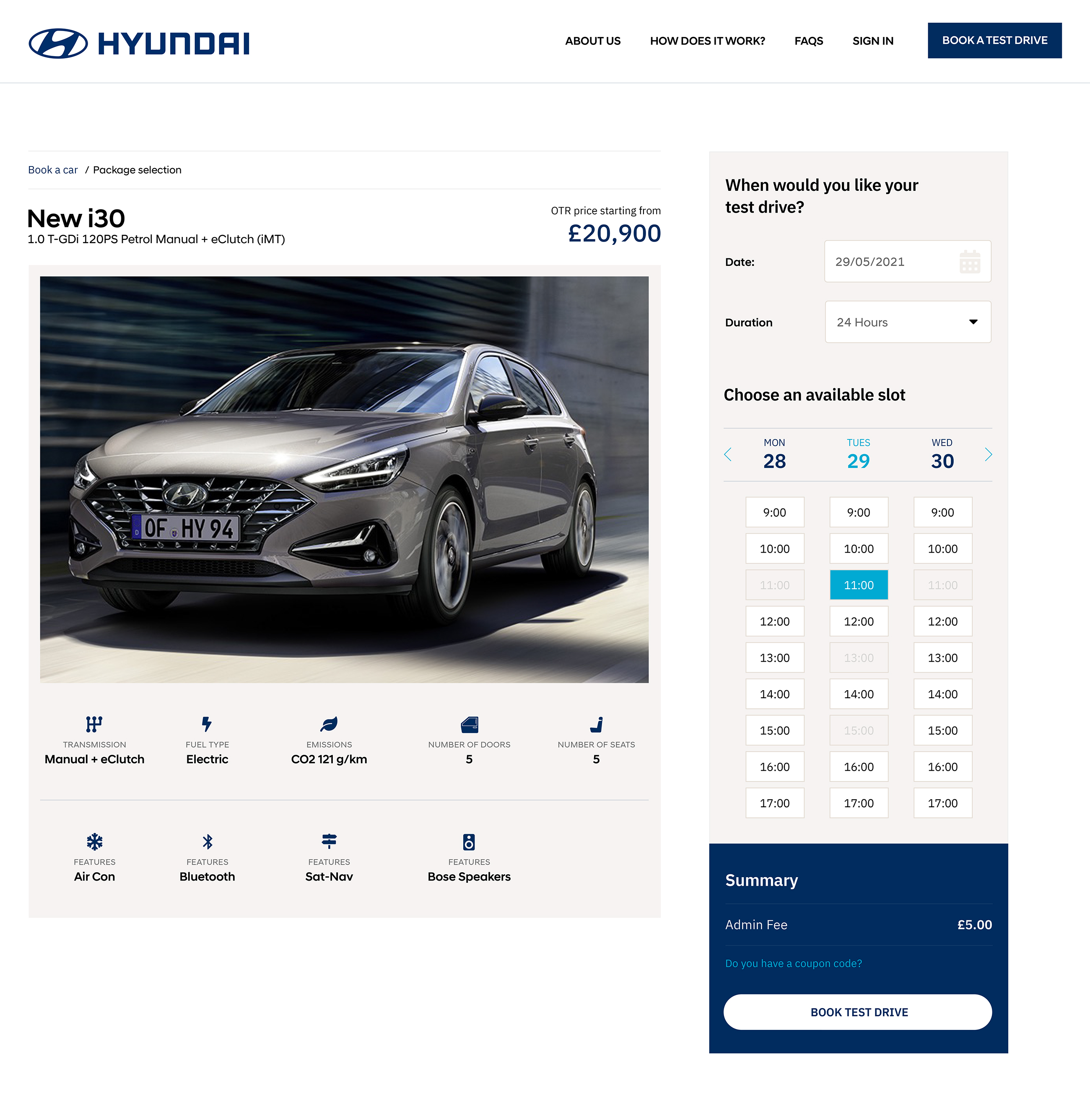
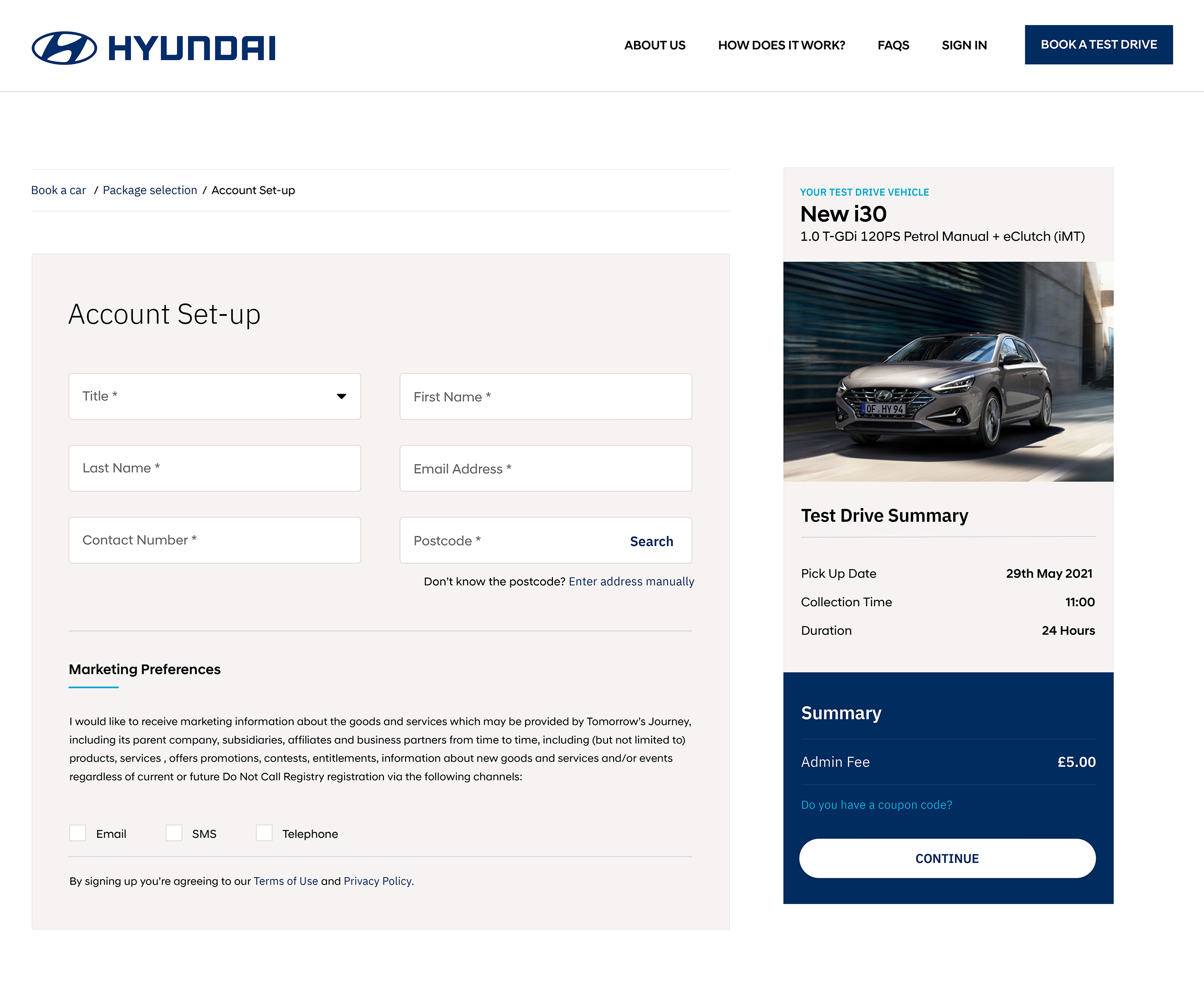
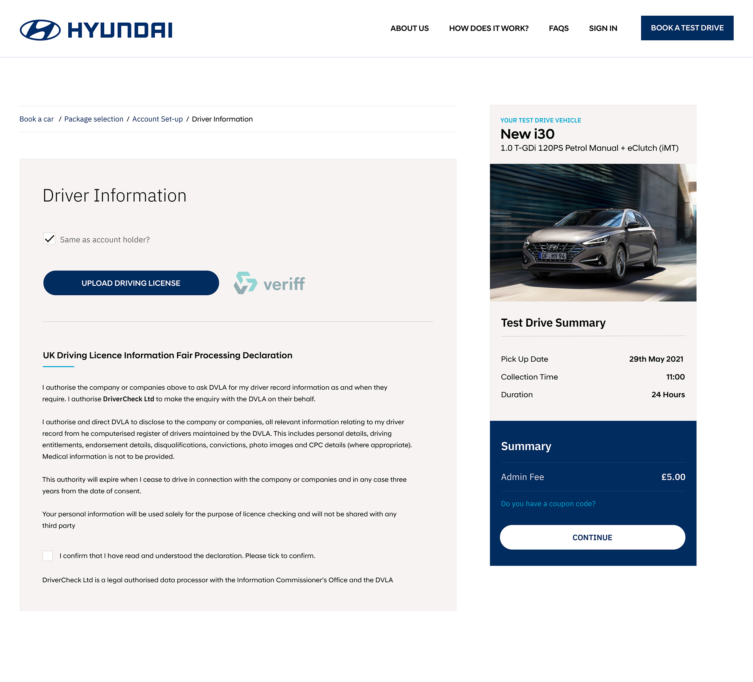
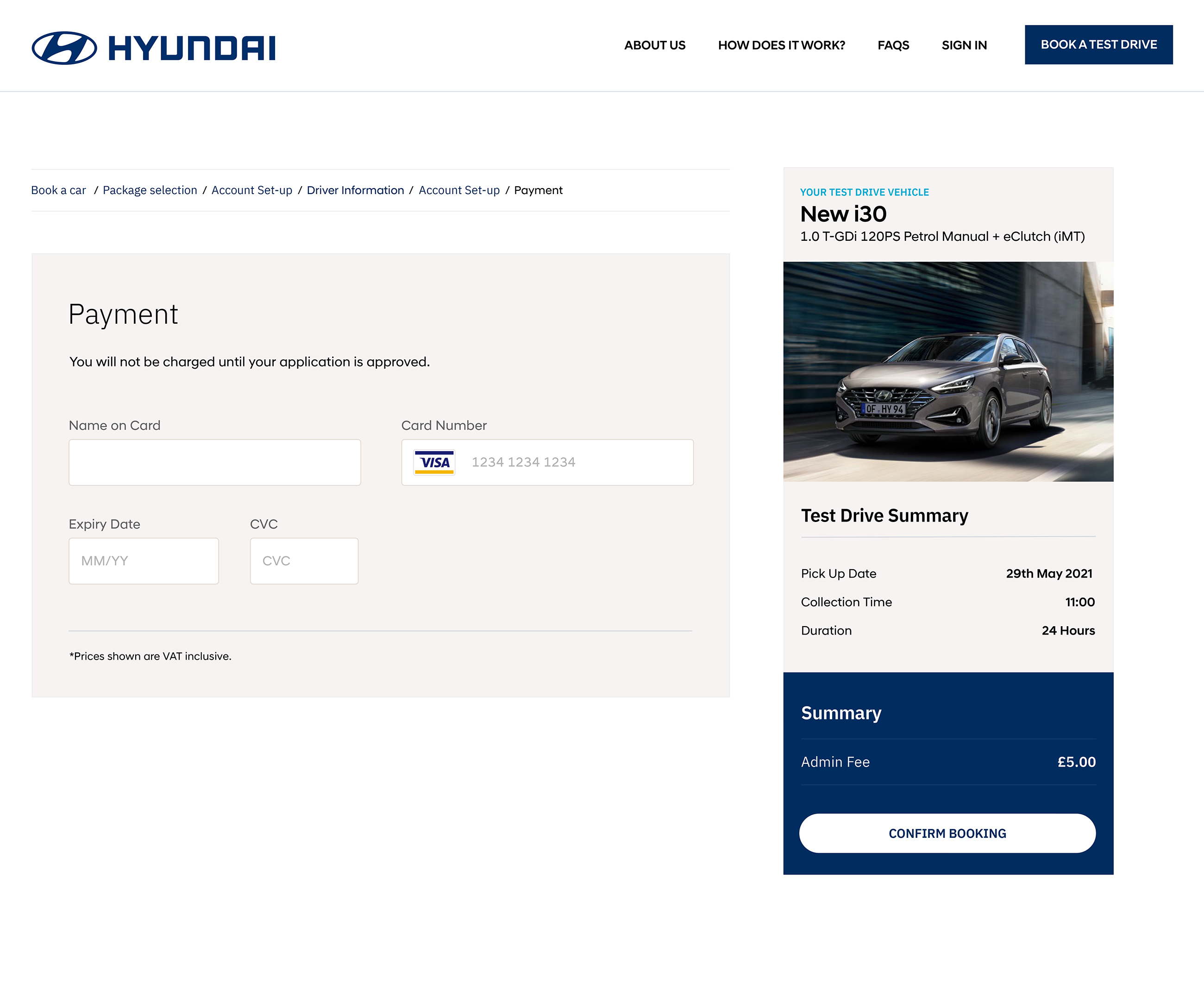
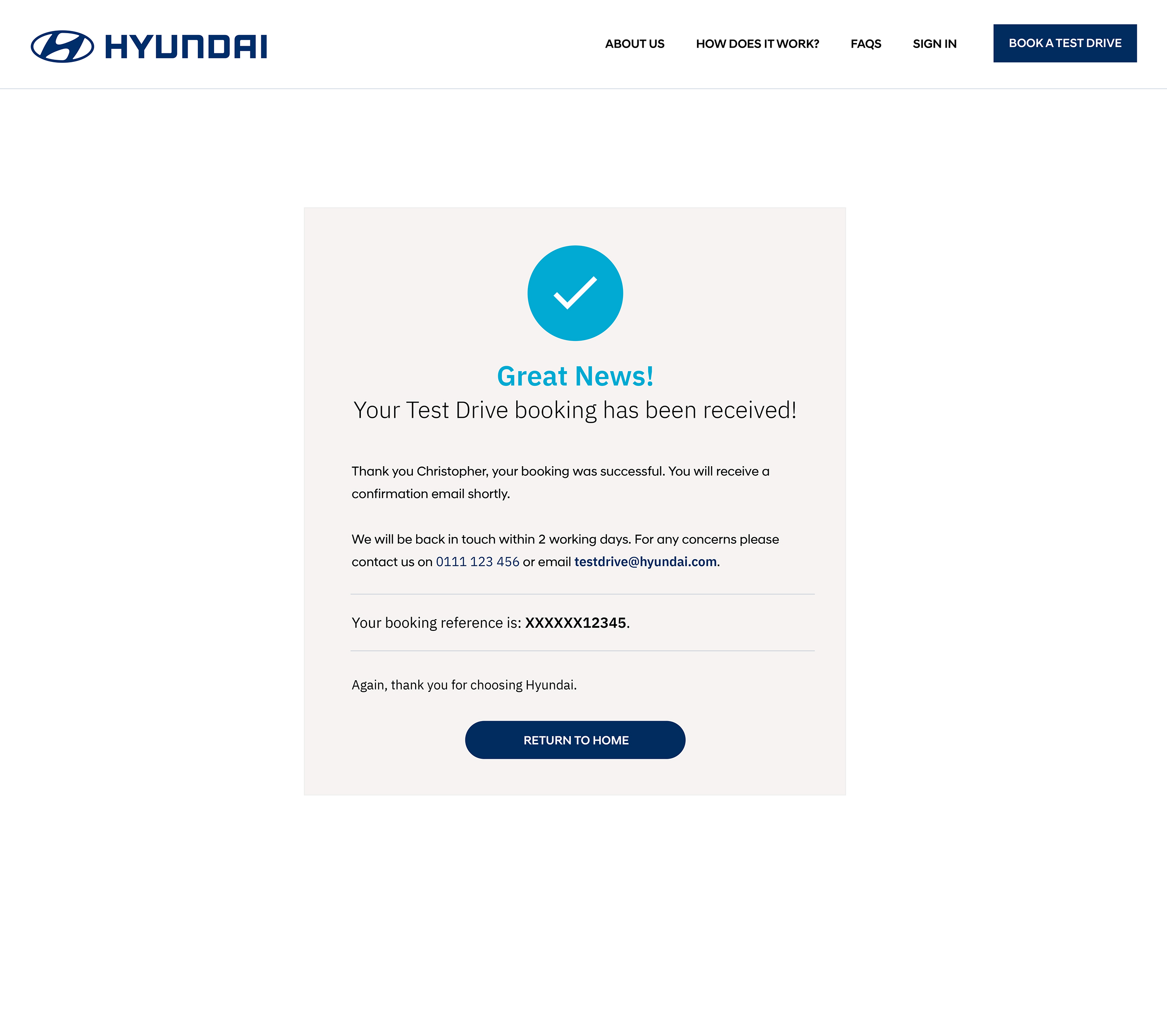
Design Project

Hyundai Test Drive

The brief

I was commissioned to design the full end-to-end journey for booking a test drive for a Hyundai vehicle, as part of a pitch by a contactless car rental company looking to showcase their booking engine to Hyundai.

This work represents the customer-facing front-end of the booking journey. Alongside this customer-facing journey, I also designed the booking engine account and management experience, which is documented on a separate project page, here.

The client was very pleased with the final outcome, and the designs played an important role in communicating the strength of their contactless rental platform during the pitch process.

Product Listing Page (PLP)

The scope of the project covered the complete front-end experience, beginning with the Product Listing Page (PLP), where users could browse and select a vehicle. This included the design of a flexible filter bar with multiple filter options to help users quickly narrow down their choice, as well as the individual product cards that each vehicle would sit within.

A key requirement was clarity at a glance. To support this, I designed a clear icon system to highlight important vehicle features such as electric or manual transmission, air conditioning, and Bluetooth. The overall visual direction focused on a clean, modern aesthetic that aligned closely with Hyundai’s brand colours and premium feel.

The product listing page of the Hyundai Test Drive
Images are displayed at high resolution to showcase design quality.
A red Hyundai car parked

Product Detail Page (PDP)

For the Product Detail Page (PDP), the focus shifted from browsing to decision-making, with an emphasis on clarity, usability, and reassurance. A key objective was to surface the most important vehicle information quickly, using clear, instantly recognisable icons for features such as transmission type, fuel type, emissions, air conditioning, and Bluetooth. This ensured users could understand the essentials at a glance without being overwhelmed by text.

The most critical component of the page was the booking experience. I designed a prominent date and time slot picker that allowed users to easily select when they wanted their test drive. To inform this, I reviewed a number of well-established booking and rental platforms, focusing on patterns that felt familiar and intuitive. The resulting layout clearly grouped days and times, making availability easy to scan and reducing friction in the booking process.

Visually, the page balanced strong product imagery with a structured, modular layout, keeping the experience clean and approachable while maintaining a premium feel aligned with Hyundai’s brand. The end result was a PDP that guided users smoothly from consideration to booking, with a clear focus on usability and confidence at every step..

The product listing page of the Hyundai Test Drive
A red Hyundai car parked

Account Pages

The next stage of the journey focused on the account pages, where users completed their booking by entering personal details such as their name and address, uploading driving licence information, and providing payment details. The final step confirmed the booking, giving users confidence that everything had been successfully completed.

These pages were designed to be clear, structured, and reassuring, breaking the process into manageable steps to reduce friction and minimise the effort required from the user at a critical point in the journey.

The product listing page of the Hyundai Test Drive